$0.00

 Canvas Prints
 Framed Prints
 Metal Wall Prints
 Mounted Wall Prints
 Photo Books
 Photo Plaques
 A-Frame Boards
 Acrylic Boards
 Aluminum Boards
 Banners
 Banner Stands
 Cardboard Signs
 Car Magnets
 Foam Boards
 Plastic Signage
 Table Tents
 Yard Signs
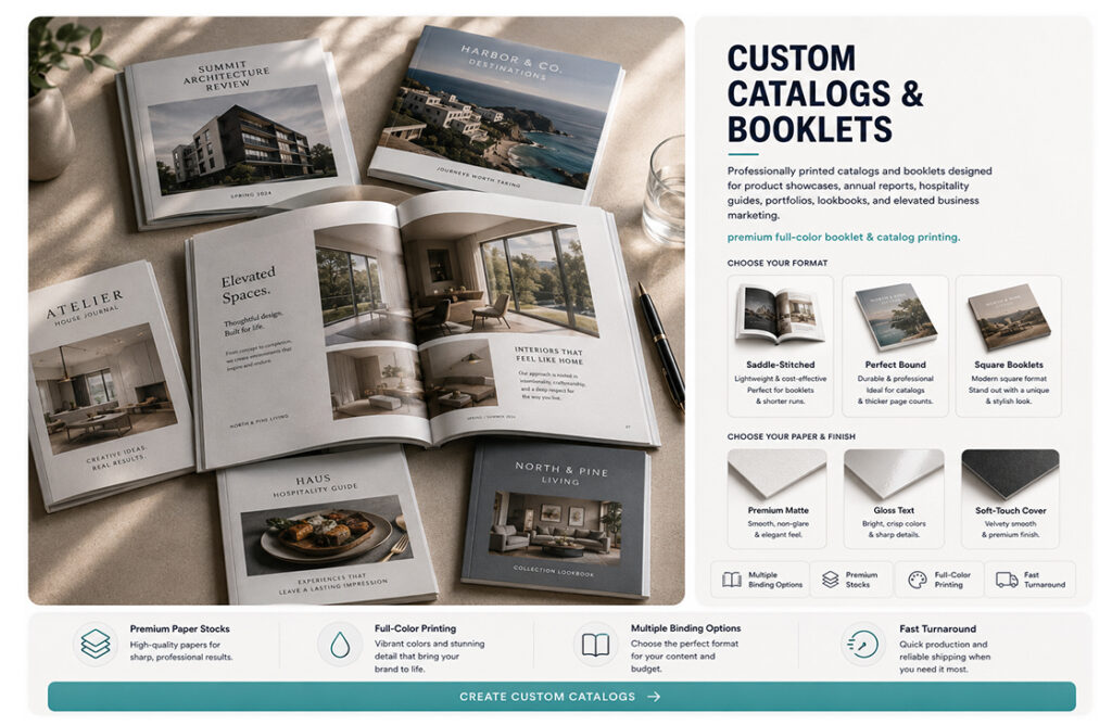
 Booklets & Catalogs
 Bookmarks
 Brochures
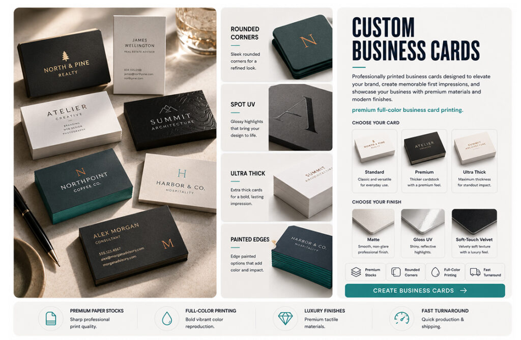
 Business Cards
 Door Hangers
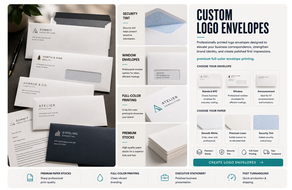
 Envelopes – Custom
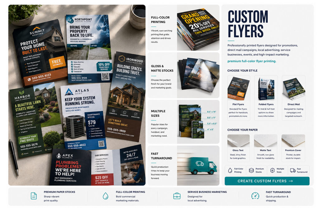
 Flyers
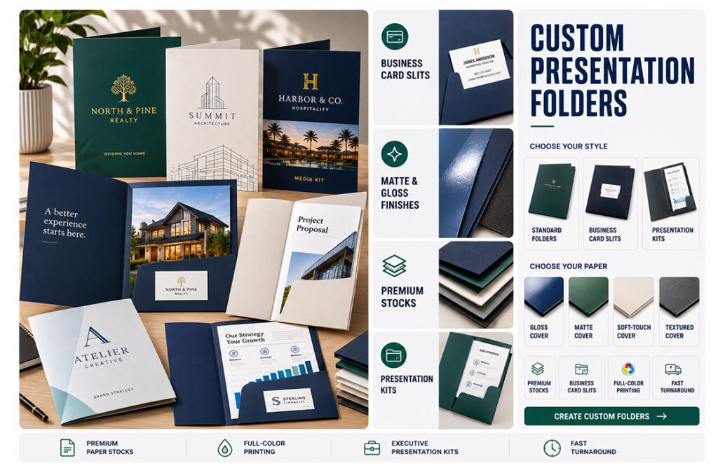
 Folders
 Rack Cards
 Rip Cards
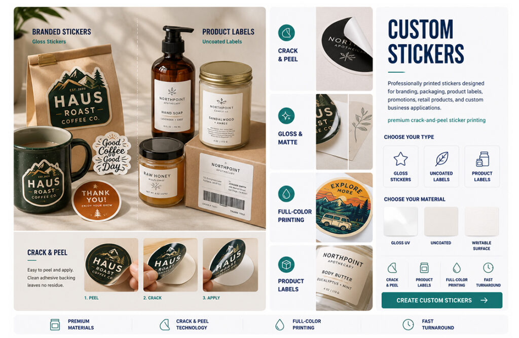
 Stickers
 Beanies
 Calendars
 Can Coolers
 Drawstring Bags
 Hats
Hats Hoodies
 Mouse Pads
 Poker Chips
 Polos
Polos Puzzles
 T-Shirts
 Canvas Bags
 Coasters
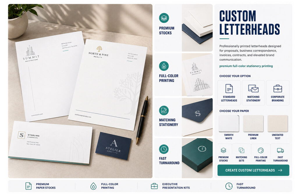
 Letterhead
 Mugs
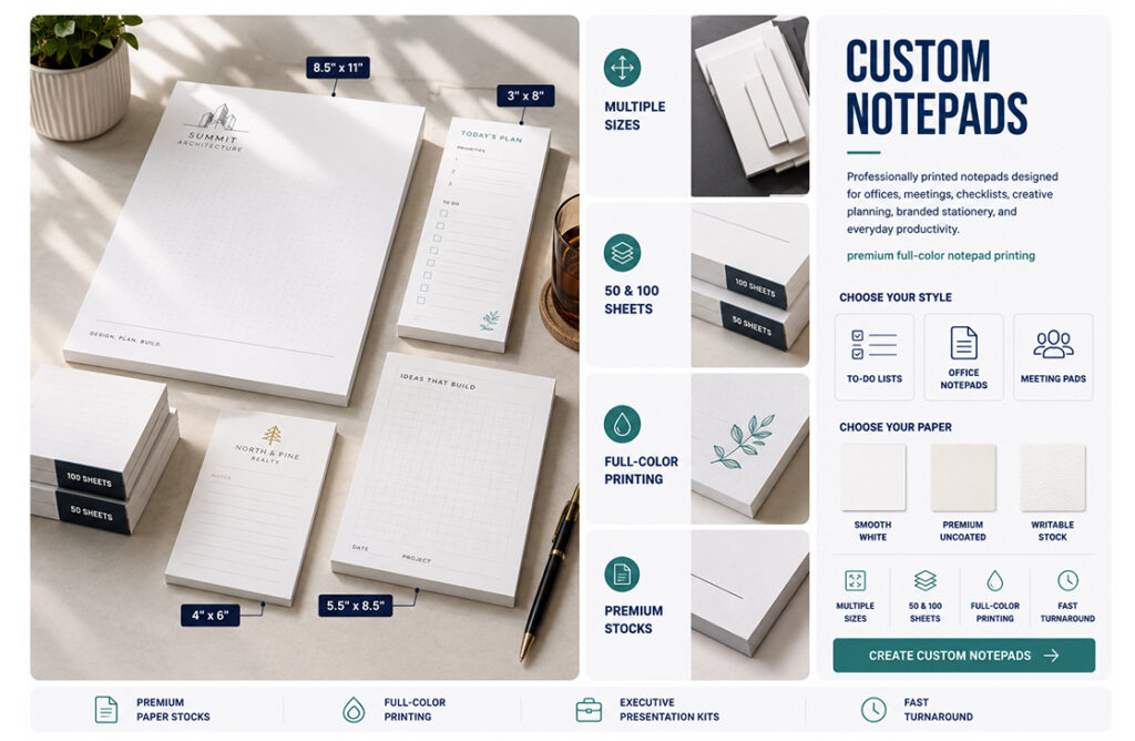
Mugs Notepads
 Posters
 Roll Labels
 Window Clings
 Window Decals
 Window Perfs


 PVC Boards
When people think about creating eye-catching printed materials, they often assume that more color means more impact. It’s an understandable assumption, but in reality, some of the most memorable designs use surprisingly few colors.
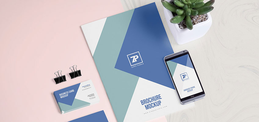
From iconic brand logos to beautifully designed brochures and product packaging, many successful businesses rely on a carefully chosen color palette design instead of filling every inch with bright, competing colors. A limited palette creates focus, strengthens brand recognition, and often makes printed materials feel more polished and professional.
Whether you’re designing business cards, flyers, posters, or packaging, using fewer colors can actually help your message stand out.
Great design isn’t about using every tool available—it’s about using the right ones intentionally.
Less Can Be More
One of the biggest goals of good design is communication. Every element on the page should help guide the viewer’s attention toward the most important information.
When too many colors compete for attention, the design can quickly become overwhelming. Headlines get lost, calls to action become less noticeable, and the overall layout feels cluttered.
By limiting your colors to a small, intentional palette, you create visual harmony. Readers know where to look first, making the design easier to understand and more enjoyable to experience.
That’s one reason why minimalist branding has become so popular in recent years. Simple doesn’t mean boring—it means purposeful.
Strong Brands Use Consistent Colors
Think about some of the world’s most recognizable brands. Many are instantly identified by just two or three signature colors.
That’s no accident.
A consistent color palette design helps customers recognize your business across every platform, whether they’re looking at your website, scrolling through social media, or holding one of your printed brochures.
Using the same colors throughout your marketing materials creates familiarity. Over time, those colors become associated with your business, making your brand easier to remember.
Consistency is especially important when printing business cards, presentation folders, catalogs, signage, and promotional products. The more cohesive your branding is, the more professional your company appears.

Color Creates Emotion
Every color communicates something.
Blue often suggests trust and reliability. Green is commonly associated with growth and nature. Red conveys energy and excitement, while black often communicates sophistication and luxury.
Choosing a limited selection of colors allows those emotional associations to work together instead of competing with one another.
Rather than overwhelming customers with every color imaginable, a focused palette reinforces your message and strengthens your overall brand identity.
Why Print Color Matters
Colors don’t always look the same in print as they do on a computer monitor.
Digital screens create color using light, while printers reproduce color with ink on paper. Because of this difference, careful planning is essential for achieving consistent print color.
Paper stock, coatings, lighting conditions, and the printing process itself can all influence how colors appear in the finished product.
Working with an experienced print provider helps ensure your chosen colors remain accurate across brochures, postcards, flyers, packaging, and other marketing materials. That consistency helps protect your brand and creates a more professional presentation.
Simplicity Improves Readability
Another advantage of limited color palettes is improved readability.
When text, graphics, and backgrounds all use contrasting but complementary colors, readers can quickly scan the page without feeling overwhelmed.
Instead of relying on dozens of bright colors to attract attention, designers often use spacing, typography, imagery, and composition to create emphasis.
This approach results in cleaner layouts and more effective communication—two hallmarks of great graphic design.
Save Money Without Sacrificing Style
A limited color palette can sometimes provide practical benefits as well.
Depending on the printing method and project, using fewer colors may reduce production complexity and help maintain consistency across large print runs. Even when full-color digital printing is used, simpler color schemes often produce cleaner, more timeless designs that don’t feel tied to short-lived trends.
In other words, limiting your colors doesn’t limit your creativity. In many cases, it enhances it.
Let Your Design Speak Clearly
Great design isn’t about using every tool available—it’s about using the right ones intentionally.
A thoughtful color palette design helps organize information, reinforce minimalist branding, improve print color consistency, and create stronger graphic design that customers remember long after they’ve seen it.
At Haus Print Shop, we work with businesses, designers, and creative professionals to turn great ideas into beautifully printed marketing materials. Whether you’re creating business cards, brochures, posters, packaging, or promotional products, our team can help ensure your colors look just as impressive in print as they do on your screen.
Sometimes the strongest design statement isn’t adding more color—it’s knowing exactly when to use less.