$0.00

 Canvas Prints
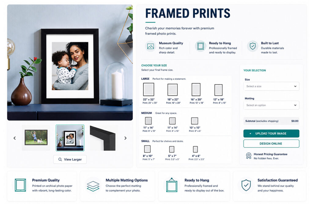
 Framed Prints
 Metal Wall Prints
 Mounted Wall Prints
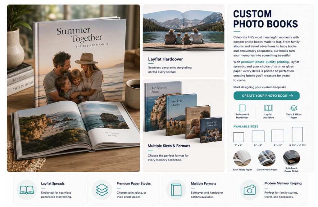
 Photo Books
 Photo Plaques
 A-Frame Boards
 Acrylic Boards
 Aluminum Boards
 Banners
 Banner Stands
 Cardboard Signs
 Car Magnets
 Foam Boards
 Plastic Signage
 Table Tents
 Yard Signs
 Booklets & Catalogs
 Bookmarks
 Brochures
 Business Cards
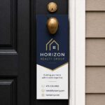 Door Hangers
 Envelopes – Custom
 Flyers
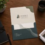 Folders
 Rack Cards
 Rip Cards
 Stickers
 Beanies
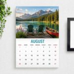 Calendars
 Can Coolers
 Drawstring Bags
 Hats
Hats Hoodies
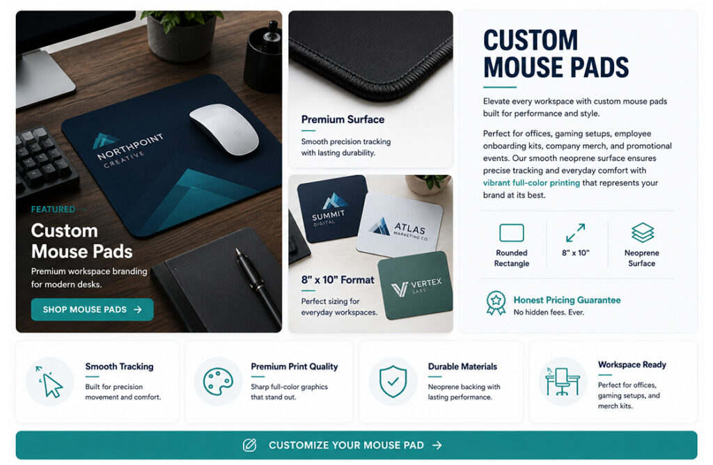
 Mouse Pads
 Poker Chips
 Polos
Polos Puzzles
 T-Shirts
 Canvas Bags
 Coasters
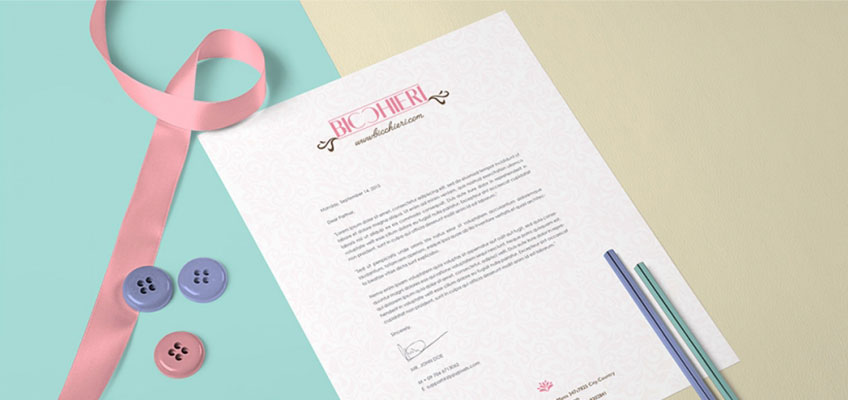
 Letterhead
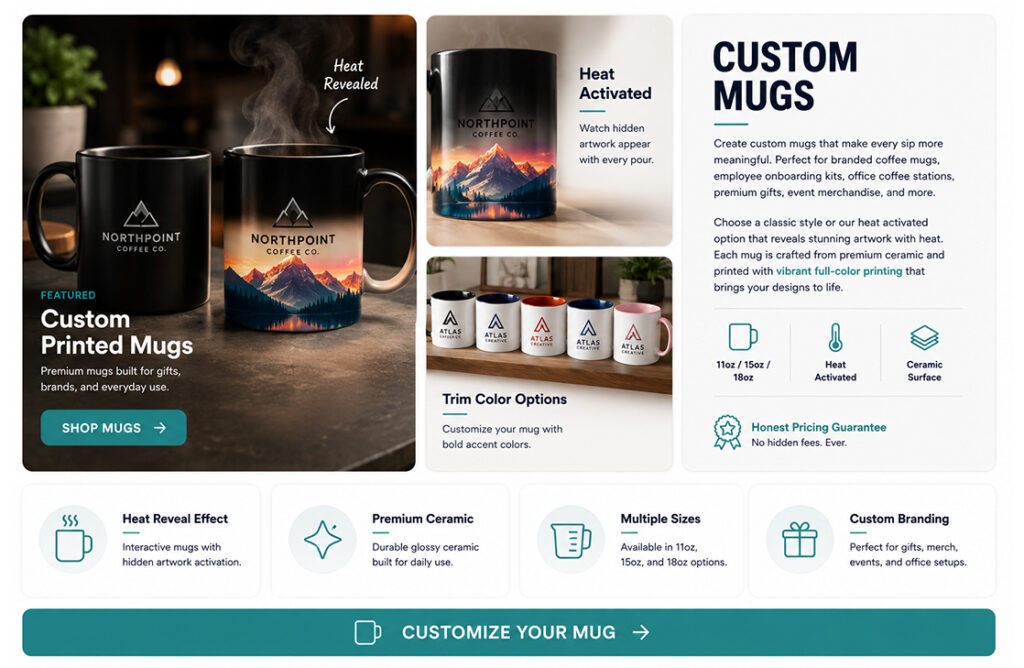
 Mugs
Mugs Notepads
 Posters
 Roll Labels
 Window Clings
 Window Decals
 Window Perfs
 PVC Boards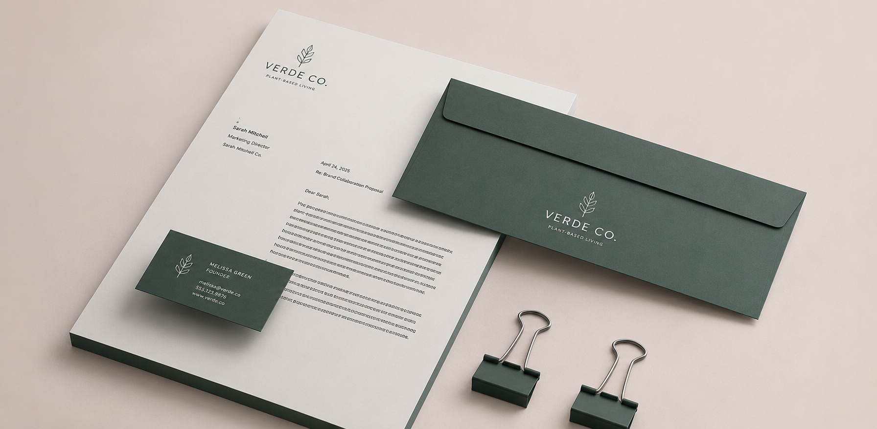
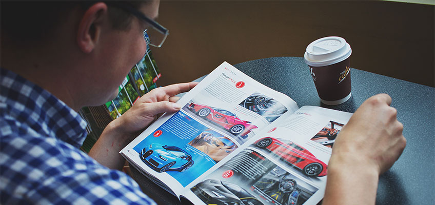
A great design grabs your attention before you even realize why. Whether it’s a brochure that encourages you to keep reading, a flyer that gets pinned to the refrigerator, or a poster that stops someone in their tracks, the secret is almost always the same: thoughtful composition.
While eye-catching colors and beautiful images certainly help, the strongest printed marketing pieces are built on proven graphic design principles that guide the viewer through the message. When combined with professional printing, these principles create materials that don’t just look good—they get results. Strong composition and visual hierarchy are among the most important factors that determine whether someone notices and understands a printed piece in just a few seconds.
Sharp colors, crisp typography, premium paper stocks, and accurate finishing help preserve every detail that designers worked hard to create.
Start with Visual Hierarchy
One of the most important concepts in graphic design is visual hierarchy. Simply put, it determines the order in which people notice information.
Think about the last flyer or poster that caught your eye. Chances are you noticed the headline first, then the image, followed by supporting details and finally the call to action. That wasn’t an accident—it was intentional design.
Designers create visual hierarchy by using:
- Larger headlines
- Bold typography
- Color contrast
- Strategic spacing
- Strong imagery
When every element competes for attention, nothing stands out. A clear hierarchy ensures readers instantly know what’s most important.
Balance Creates Confidence
Balance doesn’t necessarily mean everything has to be perfectly symmetrical. Instead, it’s about making a layout feel stable and intentional.
A well-balanced print layout distributes text, photos, logos, and white space so the design feels comfortable to read. If one side of a brochure feels overcrowded while the other is nearly empty, readers may subconsciously perceive the piece as disorganized.
Professional designers often use invisible grid systems to keep every element aligned and proportional. Even though customers never see the grid itself, they immediately notice when everything feels polished and easy to follow.
Don’t Be Afraid of White Space
Many people assume every inch of a flyer or brochure needs to be filled with content. In reality, empty space is one of the most powerful design tools available.
White space gives important elements room to breathe. It improves readability, highlights key messages, and keeps printed materials from feeling cluttered.
Adding more information isn’t always the answer. Sometimes removing unnecessary elements makes the design much stronger.
Contrast Makes Information Easier to Read
Contrast is another essential part of effective design composition.
High contrast helps readers quickly distinguish between headlines, body copy, images, and calls to action. This can be achieved through:
- Font size differences
- Bold versus regular typography
- Light and dark colors
- Large versus small images
- Thick and thin graphic elements
Without enough contrast, everything blends together and readers lose interest before absorbing your message.
Keep Alignment Consistent
Alignment may seem like a small detail, but it has a huge impact on professionalism.
Every text box, image, icon, and logo should feel connected within the layout. Random placement creates visual confusion, while consistent alignment creates order and trust.
Whether you’re designing brochures, postcards, posters, or sales sheets, good alignment makes information easier to scan and understand.
Design for Print, Not Just the Screen
One common mistake is creating artwork that looks fantastic on a computer monitor but doesn’t translate well to paper.
Printed materials have different lighting conditions, viewing distances, textures, and color reproduction than digital screens. A poster viewed across a room needs larger typography and stronger contrast than an image viewed on a smartphone.
Likewise, brochures benefit from carefully chosen paper stocks, finishes, and folds that enhance the overall experience. Professional printing brings these details to life, giving your designs a quality that digital previews simply can’t replicate.
Professional Printing Completes Great Design
Even the strongest composition can lose its impact if it’s printed on poor-quality materials.
Sharp colors, crisp typography, premium paper stocks, and accurate finishing help preserve every detail that designers worked hard to create. That’s why investing in professional printing is just as important as investing in good design.
At Haus Print Shop, we help businesses transform great ideas into professionally printed marketing materials that leave a lasting impression. Whether you’re creating brochures, flyers, posters, postcards, or promotional pieces, combining smart graphic design principles, an intentional print layout, effective visual hierarchy, and thoughtful design composition ensures your message stands out long after someone picks it up.
The best printed materials don’t happen by chance. They happen when strong design and quality printing work together.