$0.00

 Canvas Prints
 Framed Prints
 Metal Wall Prints
 Mounted Wall Prints
 Photo Books
 Photo Plaques
 A-Frame Boards
 Acrylic Boards
 Aluminum Boards
 Banners
 Banner Stands
 Cardboard Signs
 Car Magnets
 Foam Boards
 Plastic Signage
 Table Tents
 Yard Signs
 Booklets & Catalogs
 Bookmarks
 Brochures
 Business Cards
 Door Hangers
 Envelopes – Custom
 Flyers
 Folders
 Rack Cards
 Rip Cards
 Stickers
 Beanies
 Calendars
 Can Coolers
 Drawstring Bags
 Hats
Hats Hoodies
 Mouse Pads
 Poker Chips
 Polos
Polos Puzzles
 T-Shirts
 Canvas Bags
 Coasters
 Letterhead
 Mugs
Mugs Notepads
 Posters
 Roll Labels
 Window Clings
 Window Decals
 Window Perfs
 PVC Boards
When people think about branding, they often focus on logos, typography, or catchy slogans. But one of the most powerful marketing tools is something much simpler: color. Whether you’re designing product packaging, creating a brochure, or ordering promotional products, the colors you choose can influence how customers perceive your business before they read a single word.
The colors you choose don’t just make your brand look good—they shape how customers feel about your business before they read a single word
That’s the power of color psychology.
For businesses investing in print marketing, understanding how different colors affect emotions and buying decisions can help create stronger, more memorable brands. Combined with high-quality custom printing, the right branding colors can make your marketing materials stand out, build trust, and encourage customers to take action.
Why Color Is More Than Just Decoration
Have you ever noticed how certain brands instantly come to mind when you see a specific color? That’s no accident.
Color plays a huge role in brand recognition because our brains process visual information incredibly fast. Long before someone reads your company name or understands your message, they’re already forming an opinion based on what they see.
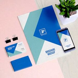
In many cases, your printed materials—whether it’s a business card, direct mail piece, banner, or product packaging—are your customer’s first physical interaction with your brand. Choosing the right colors helps ensure that first impression is a positive one.
The goal isn’t simply to make something look attractive. It’s to communicate your company’s personality without saying a word.
What Different Colors Say About Your Brand
While every audience is different, certain colors consistently evoke similar emotions. Understanding these associations can help you make smarter design decisions.
Blue Builds Trust
Blue is one of the most commonly used branding colors, and for good reason. It communicates reliability, professionalism, and confidence.
Banks, healthcare companies, technology firms, and professional service businesses often use blue because it helps customers feel comfortable doing business with them.
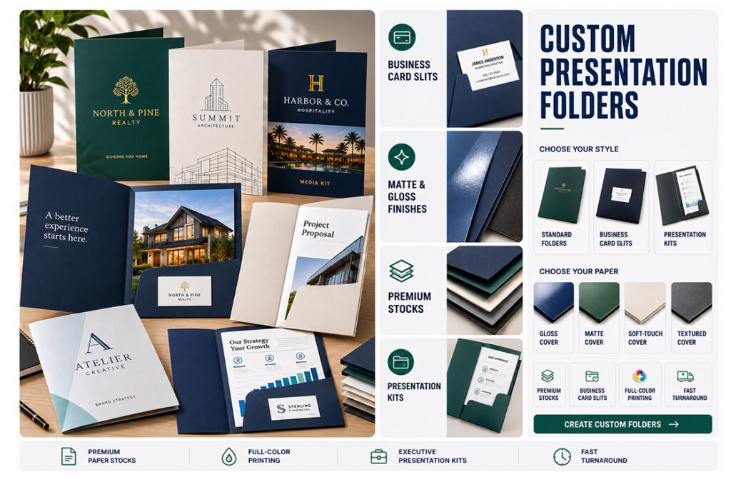
If your goal is to establish credibility, blue is a dependable choice for print marketing materials like brochures, business cards, and presentation folders.
Red Demands Attention
Red creates excitement and urgency.
It’s energetic, bold, and naturally draws the eye, making it perfect for sales promotions, event signage, postcards, and limited-time offers.
Because red encourages action, it’s often used to highlight important information or promotional messaging without overwhelming the entire design.
Green Represents Growth
Green is strongly associated with health, sustainability, nature, and freshness.
Businesses in landscaping, agriculture, wellness, nutrition, and environmentally conscious industries often incorporate green throughout their printed marketing materials to reinforce those values.
It also creates a calm, balanced feeling that customers tend to associate with trust and long-term stability.
Black Feels Premium
Simple doesn’t have to mean boring.
Black is elegant, sophisticated, and timeless. Luxury brands frequently pair black with clean typography and minimalist layouts to create printed materials that feel high-end.
Whether you’re producing premium packaging or upscale marketing collateral, black often communicates quality before customers even touch the product.
Yellow and Orange Create Optimism
Warm colors like yellow and orange naturally attract attention while creating feelings of happiness, creativity, and enthusiasm.
Restaurants, retail stores, schools, and family-focused businesses often use these colors because they feel approachable and energetic.
Used thoughtfully, they can make promotional materials feel inviting without becoming overwhelming.
Consistency Is What Makes Colors Powerful
Choosing the perfect color palette is only the beginning.
The brands people remember are the ones that use those colors consistently across every customer interaction.
Your website, social media graphics, packaging, direct mail, signage, promotional products, apparel, and printed marketing materials should all feel connected.
When customers repeatedly encounter the same branding colors, they begin recognizing your business instantly—even before they see your logo.
That consistency builds familiarity, and familiarity builds trust.
Print Colors Aren’t the Same as Digital Colors
One challenge businesses often encounter is expecting colors on a computer screen to look identical when they’re printed.
Digital designs are created using RGB colors, while commercial printing uses CMYK inks. Since these color systems produce color differently, some shades can shift slightly when transferred from screen to paper.
This is where professional custom printing makes a real difference.
Experienced printers understand color management, paper selection, ink density, and finishing techniques that help maintain accurate, consistent colors across every printed piece.
The result is a brand that looks just as professional in someone’s hands as it does on their phone or computer.
Let Your Colors Tell Your Story
Every business has its own personality.
Maybe your brand is energetic and fun. Maybe it’s sophisticated and refined. Maybe it’s focused on sustainability or innovation.
The colors you choose should support that story—not compete with it.
Before selecting your brand palette, ask yourself:
- What emotions do we want customers to feel?
- What values define our business?
- What makes us different from our competitors?
- Will these colors still represent our brand years from now?
Answering those questions often leads to stronger design decisions that continue paying dividends long after your materials are printed.
Bring Your Brand to Life with Haus Print
At Haus Print, we know that outstanding print marketing is about more than putting ink on paper. It’s about helping businesses create memorable experiences through thoughtful design, exceptional quality, and consistent branding.
Whether you’re printing brochures, business cards, direct mail, packaging, signage, apparel, or promotional products, our team helps ensure your branding colors look vibrant, accurate, and professional on every project.
When color psychology is paired with expert custom printing, your marketing materials become more than just printed pieces—they become powerful brand-building tools that customers remember long after they’ve left your hands.