$0.00

 Canvas Prints
 Framed Prints
 Metal Wall Prints
 Mounted Wall Prints
 Photo Books
 Photo Plaques
 A-Frame Boards
 Acrylic Boards
 Aluminum Boards
 Banners
 Banner Stands
 Cardboard Signs
 Car Magnets
 Foam Boards
 Plastic Signage
 Table Tents
 Yard Signs
 Booklets & Catalogs
 Bookmarks
 Brochures
 Business Cards
 Door Hangers
 Envelopes – Custom
 Flyers
 Folders
 Rack Cards
 Rip Cards
 Stickers
 Beanies
 Calendars
 Can Coolers
 Drawstring Bags
 Hats
Hats Hoodies
 Mouse Pads
 Poker Chips
 Polos
Polos Puzzles
 T-Shirts
 Canvas Bags
 Coasters
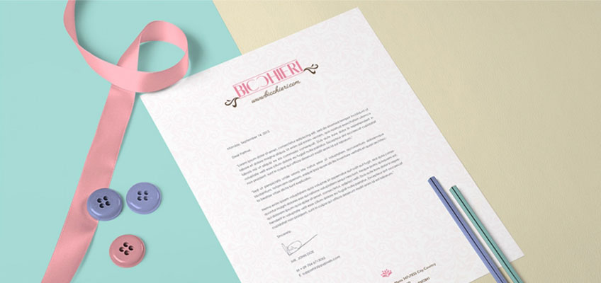
 Letterhead
 Mugs
Mugs Notepads
 Posters
 Roll Labels
 Window Clings
 Window Decals
 Window Perfs
 PVC Boards
Have you ever picked up a brochure and immediately knew where to look first? Or glanced at a flyer and instantly understood the most important message without reading every word?
That isn’t an accident—it’s the result of good design.
One of the most important concepts in effective print marketing is visual hierarchy. It’s the way designers organize information so the viewer’s eyes naturally move from the most important content to the supporting details. When done well, visual hierarchy makes printed materials easier to read, more engaging, and ultimately more effective.
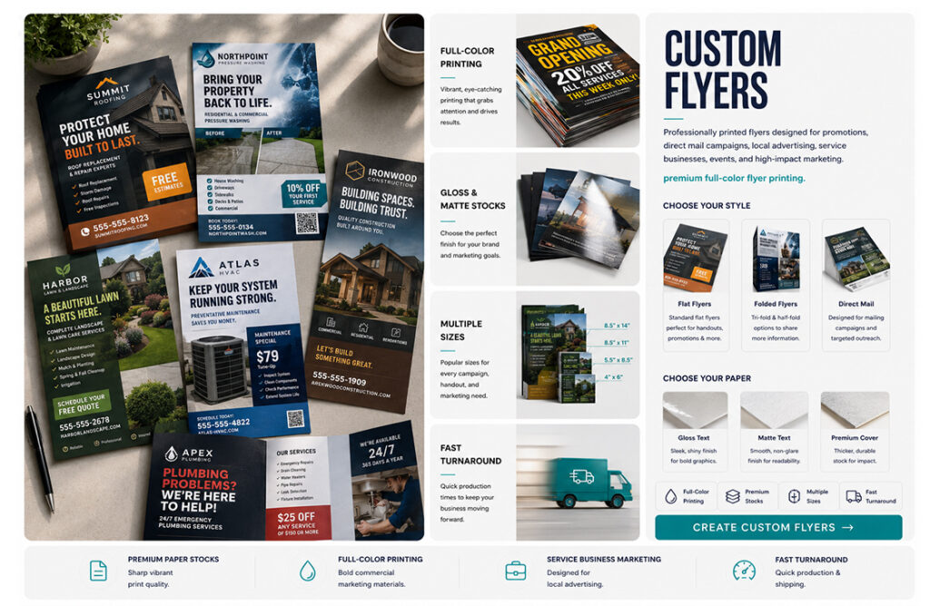
Whether you’re creating a flyer, catalog, postcard, or working on brochure design, understanding a few key graphic design principles can dramatically improve the way your message is received.
Sharp typography, vibrant colors, premium paper stocks, and precise finishing all help preserve the visual hierarchy you’ve carefully created.
What Is Visual Hierarchy?
Simply put, visual hierarchy is the order in which people notice information.
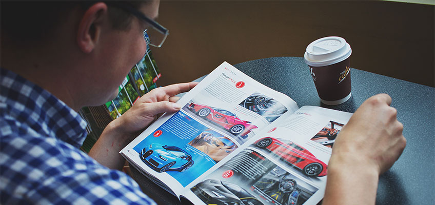
When someone picks up a printed piece, they don’t read every word from top to bottom. Instead, their eyes quickly scan the page, looking for visual clues that tell them what’s important.
Good designers intentionally guide that journey.
The goal is to answer a few questions almost immediately:
- What is this?
- Why should I care?
- What should I do next?
If readers have to search for those answers, there’s a good chance they’ll lose interest before finding them.
Size Creates Importance
One of the easiest ways to establish hierarchy is through size.
Larger headlines naturally attract attention before smaller body text. That’s why the most important message on your flyer or brochure should almost always be the biggest element on the page.
Supporting headlines should be smaller, while body copy remains easy to read without competing for attention.
A common mistake is making everything the same size. When every element looks equally important, nothing stands out.
Good print layout design creates contrast so readers know exactly where to begin.
Use White Space to Your Advantage
Many people think they need to fill every inch of a brochure or flyer with information.
In reality, empty space is one of the most powerful design tools available.
White space gives the eye room to rest and helps important elements stand out. It separates sections, improves readability, and makes printed materials feel more organized.
Professional designers understand that what you leave out is often just as important as what you include.
A clean, balanced layout almost always performs better than one packed with text and graphics.
Color Should Guide the Eye
Color does much more than make a design attractive.
It helps direct attention.
A bright call-to-action button, a bold headline, or an accent color can naturally draw readers toward the information you want them to notice first.
The key is using color with purpose.
Too many competing colors create confusion. A limited color palette that aligns with your brand helps maintain focus while reinforcing consistency across all your marketing materials.
Images Should Support the Message
Photos and graphics often become the first thing people notice.
That’s why every image should serve a purpose.
Strong photography can reinforce your message, create emotion, and help readers understand what your business offers before they read a single sentence.
At the same time, oversized or unrelated images can distract from the information you’re trying to communicate.
The best brochure design uses imagery to complement the message—not compete with it.
Typography Matters More Than You Think
Choosing the right fonts isn’t just about style—it’s about readability.
A clear headline font paired with an easy-to-read body font creates structure and helps readers move naturally through the page.
Using too many font styles, weights, or sizes can quickly make a design feel cluttered.
Most successful printed pieces rely on just a few well-chosen typefaces used consistently throughout the layout.
Simple typography often creates a stronger impression than overly decorative fonts.
Every Design Should Lead to an Action
Effective design doesn’t stop with making something look nice.
It should encourage readers to take the next step.
Whether that’s visiting your website, scanning a QR code, calling your business, or making a purchase, your call to action should be easy to find.
Strong visual hierarchy naturally guides readers toward that action by placing it where they’ll see it after they’ve absorbed the key information.
Without a clear next step, even a beautifully designed flyer or brochure can miss its purpose.
Great Printing Brings Great Design to Life
Even the strongest design depends on high-quality printing to achieve its full impact.
Sharp typography, vibrant colors, premium paper stocks, and precise finishing all help preserve the visual hierarchy you’ve carefully created. Poor printing can reduce contrast, soften images, or make text more difficult to read, weakening the effectiveness of the entire design.
At Haus Print Shop, we help businesses, designers, and marketers turn great ideas into exceptional printed materials. Whether you’re creating flyers, catalogs, postcards, or professional brochure design, our printing experts ensure every detail is reproduced with clarity and precision.
Understanding visual hierarchy, applying proven graphic design principles, and investing in thoughtful print layout design can transform ordinary marketing materials into pieces that truly connect with readers. When your design naturally guides the eye and your printing reflects the quality of your brand, your message has a much better chance of being read—and remembered.