$0.00

 Canvas Prints
 Framed Prints
 Metal Wall Prints
 Mounted Wall Prints
 Photo Books
 Photo Plaques
 A-Frame Boards
 Acrylic Boards
 Aluminum Boards
 Banners
 Banner Stands
 Cardboard Signs
 Car Magnets
 Foam Boards
 Plastic Signage
 Table Tents
 Yard Signs
 Booklets & Catalogs
 Bookmarks
 Brochures
 Business Cards
 Door Hangers
 Envelopes – Custom
 Flyers
 Folders
 Rack Cards
 Rip Cards
 Stickers
 Beanies
 Calendars
 Can Coolers
 Drawstring Bags
 Hats
Hats Hoodies
 Mouse Pads
 Poker Chips
 Polos
Polos Puzzles
 T-Shirts
 Canvas Bags
 Coasters
 Letterhead
 Mugs
Mugs Notepads
 Posters
 Roll Labels
 Window Clings
 Window Decals
 Window Perfs
 PVC Boards
A great design can grab someone’s attention, but it’s typography that helps deliver the message.
Whether you’re creating business cards, brochures, product packaging, postcards, or banners, the fonts you choose have a direct impact on how customers experience your brand. Good typography isn’t just about finding a font that looks nice—it’s about making your message easy to read while reinforcing your company’s personality.
For businesses investing in professional printing, thoughtful print typography can make the difference between marketing materials that get noticed and those that get overlooked.
The best fonts don’t call attention to themselves—they make your message impossible to overlook.
Typography Is Part of Your Brand
Think about some of the world’s most recognizable brands. Chances are you can picture their logo, colors, and even the style of lettering they use.
That’s because branding fonts become part of a company’s identity.
A law firm might choose a classic serif font that communicates trust and professionalism. A modern tech startup may lean toward a clean, minimalist sans-serif typeface. A boutique bakery might use a handwritten font to create a warm, personal feel.
Every font tells a story before customers read a single word.
Choosing typography that matches your brand personality helps create a stronger connection with your audience and makes your business more recognizable over time.
Readability Always Comes First
It’s easy to fall in love with decorative fonts, but if customers struggle to read your message, the design isn’t doing its job.
One of the most important graphic design tips is to prioritize readability over style.
When designing printed materials:
- Choose body fonts that are clean and easy to read.
- Reserve decorative fonts for headlines or short phrases.
- Maintain enough spacing between letters and lines.
- Use font sizes that remain readable across different print formats.
- Create clear contrast between text and background colors.
Your goal is to guide readers through the page—not make them work for it.
Less Is Usually More
Another common mistake is using too many fonts in one design.
Combining four or five different typefaces often makes printed materials feel cluttered and unprofessional. Instead, stick with two or three complementary fonts.
A common approach is to use one font for headlines and another for body copy. This creates visual hierarchy while keeping the overall design clean and consistent.
Simple typography often looks more polished than an overly complicated layout.
Print and Digital Fonts Aren’t Always the Same
A font that looks fantastic on a computer screen doesn’t always perform as well in print.
Fine details can disappear when printed at smaller sizes, and some lightweight fonts become difficult to read on certain paper stocks.
That’s why print typography requires a different approach than digital design.
Professional designers consider paper type, ink coverage, viewing distance, and print size before choosing fonts. A business card has different readability requirements than a trade show banner or product catalog.
Designing specifically for print ensures your message stays clear no matter where customers see it.
Consistency Builds Recognition
Your typography should feel familiar across every customer touchpoint.
If your website uses modern, clean fonts, your brochures, packaging, signage, and promotional materials should reflect that same visual style.
Consistent branding fonts help customers recognize your business instantly, even before they notice your logo. Over time, that consistency strengthens trust and makes your brand feel more established.
The same principle applies to headlines, spacing, and overall layout. When every piece of marketing shares a cohesive look, your business appears more polished and professional.
Typography Supports Great Design
Beautiful photography, bold colors, and premium paper all play important roles in print marketing, but typography ties everything together.
Well-chosen fonts create structure, improve readability, and help customers focus on the information that matters most. Rather than competing for attention, your typography should quietly guide readers through the design while reinforcing your brand’s personality.
It’s one of the smallest details that often has the biggest impact.
Bring Your Brand to Life with Haus Print
At Haus Print, we know that exceptional printed materials are built on thoughtful design. From choosing the right paper stock to producing crisp, professional text, every detail matters.
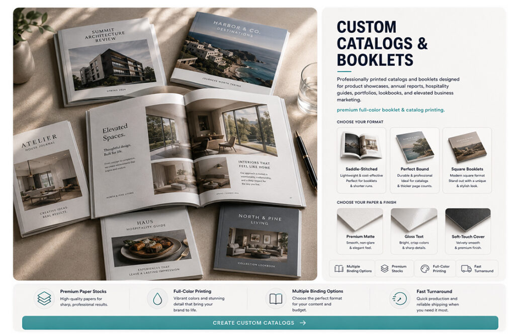
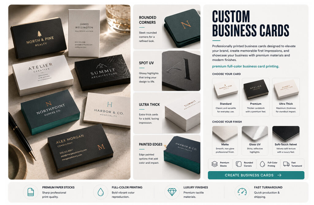
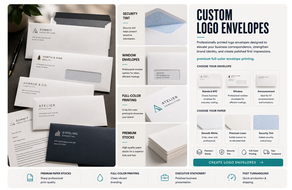
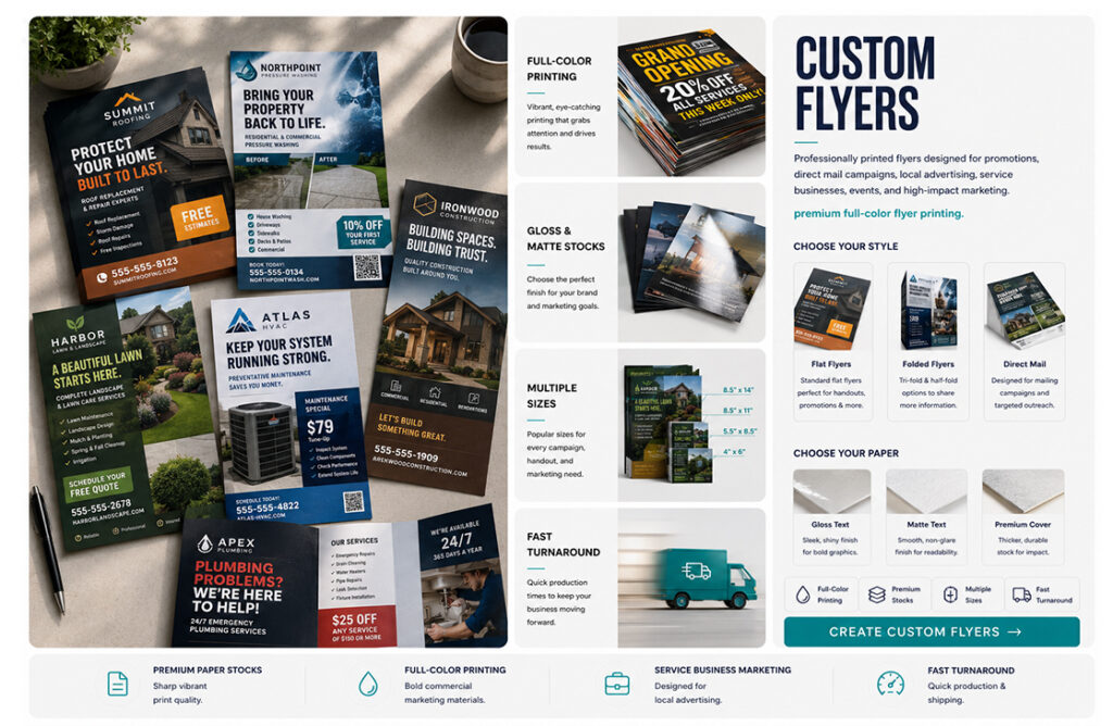
Whether you’re printing business cards, brochures, catalogs, direct mail, packaging, signage, or promotional products, our team works with businesses to ensure their typography, print typography, and branding fonts look sharp, readable, and consistent across every project.
Because great design isn’t just about looking good—it’s about making your message easy to read, easy to remember, and impossible to ignore.